Perfect Anchor Links in Squarespace
In this tutorial, I’ll show you how to build anchor links so that your header doesn’t cover the text you’re scrolling to. In this example, I’ll build a table of contents for a blog post.
Note
Squarespace has released anchor links for entire page sections. You can learn how to use them, customize their offsets, and write custom code with them here.
There is a problem with anchor links. By default, anchor links scroll your page so that the “anchor” is at the top of your screen. But if your header is fixed at the top of your screen, the anchor is hidden behind the header.
The page jumps down to the anchor, giving the user no visual reference as to where they are.
Let’s solve this by creating the perfect anchor links in Squarespace.
How Anchor Links Work
There are two steps to an anchor links:
Create your anchors using a code block and the id attribute
Add your links using the id as the url
First, let’s setup our scenario. I’m wanting to build a table of contents component on my blog page. I’ve created anchors throughout my page to designate the different sections of my page.
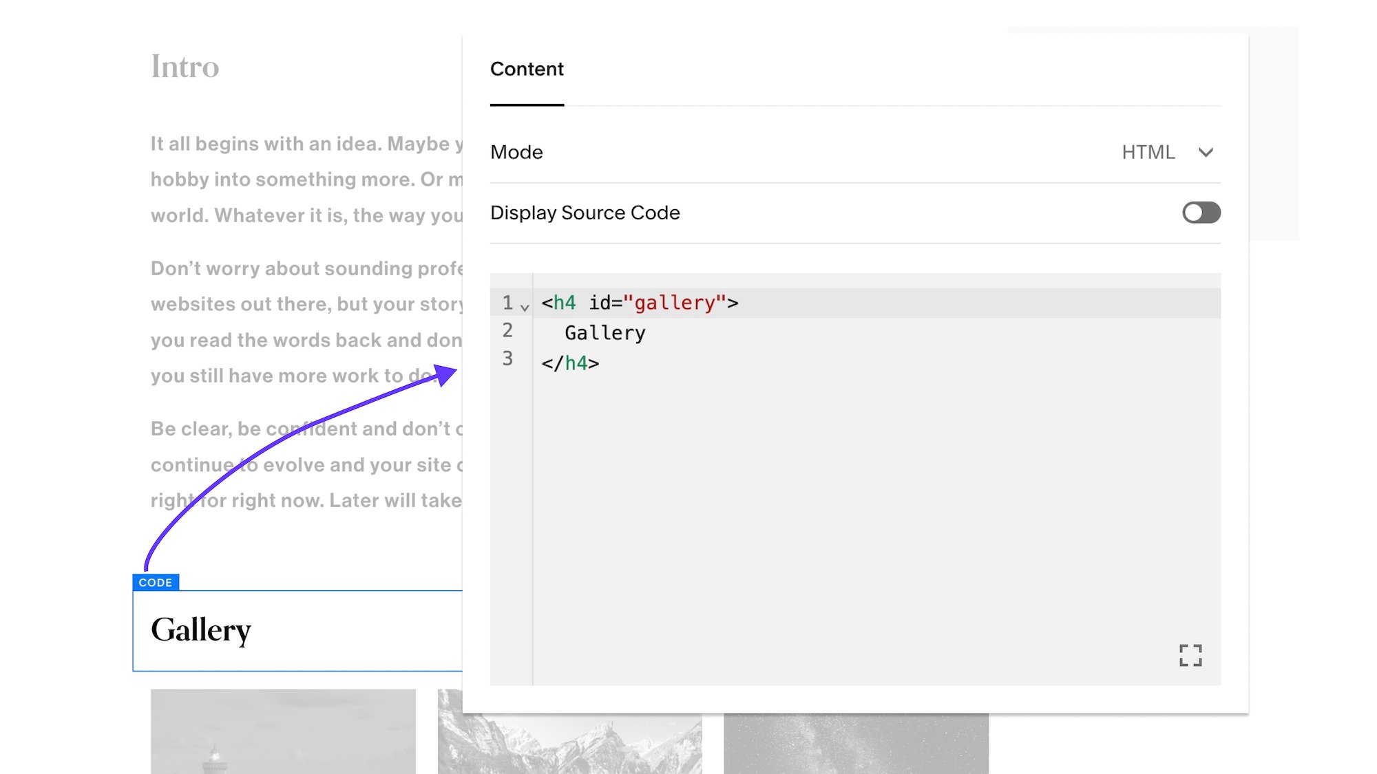
To create the anchors, I’ve added the titles of each section using code blocks and given the titles a unique id value that we can link too. For example:
<h4 id="gallery">
  Gallery
</h4>
You can use a Markdown Block here instead if you’re on a Personal Squarespace Plan.
Once I’ve create my anchors, I need to create my anchor links in the table of contents that will link to these sections. All we need to do is create a link and in the link field, link to the unique id we created earlier.
Do this for each link within your table of contents.
fun fact
If you’ve ever used an <a> element in HTML to create a link, that "a" stands for “anchor”.
Smooth Scroll
The first thing we want to fix is the jumping when we click on a link.
This is easy to solve using the scroll-behavior property. Just add this to your Custom CSS area, and voila!
html {
  scroll-behavior: smooth;
}
The page smoothly scrolls down to the anchor, giving the user a visual reference as to where they are.
And now we finally get the crux of our issue. As we click on our anchor link, the title “Gallery” is hidden behind our fixed header!
Scroll Margin
The solution here is actually quite simple. Using the scroll-margin property, we can offset where the anchor links scrolls too! However, we need to target the anchor that we’re scrolling too.
So let’s go back and update all of our anchors to include the a class that we can target and apply our scroll margin to. For simplicities sake, I’m just going to use the class, anchor-link.
<h4 id="gallery" class="anchor-link">
  Gallery
</h4>
Be sure to update all of your anchor links with this same class. Now, add the following css to our Custom CSS area to adjust how much the scroll position offsets.
html {
  scroll-behavior: smooth;
}
.anchor-link {
  scroll-margin: 150px;
}
Feel free to adjust that 150px value as you wish. I prefer to use 20vh (25% the height of the viewport) value, but pixels is easier to understand in tutorials.
<h4 id="gallery" class="anchor-link">
  Gallery
</h4>
html {
  scroll-behavior: smooth;
}
.anchor-link {
  scroll-margin: 150px;
}
Related Code Snippets
The below Code Snippets are available to Code Curious members.


